How to use the statsmodels library in Python to calculate Exponential Smoothing
Exponential smoothing is a widely used smoothening technique in business analytics that assigns exponentially decreasing weights to past observations. It is particularly useful for forecasting future values based on historical data.
There are three main types of exponential smoothing methods: simple exponential smoothing, double exponential smoothing, and triple exponential smoothing (also known as Holt-Winters method).
In pandas, you can utilize the statsmodels library in Python for exponential smoothing calculations. Here's an example of how to perform exponential smoothing using statsmodels:
The Code:
# Import the required libraries
import pandas as pd
import statsmodels.api as sm
# Create a DataFrame with a time series data
data = {'Month': ['Jan', 'Feb', 'Mar', 'Apr'],
'Sales': [100, 120, 110, 130]}
df = pd.DataFrame(data)# Set the 'Month' column as the index
df.set_index('Month', inplace=True)# Perform simple exponential smoothing
model = sm.tsa.SimpleExpSmoothing(df['Sales'])
ses_model = model.fit(smoothing_level=0.3)
df['Forecast'] = ses_model.fittedvalues# Perform double exponential smoothing
model = sm.tsa.ExponentialSmoothing(df['Sales'], trend='add')
des_model = model.fit(smoothing_level=0.3, smoothing_slope=0.2)
df['Forecast'] = des_model.fittedvalues# Perform triple exponential smoothing
model = sm.tsa.ExponentialSmoothing(df['Sales'], trend='add', seasonal='add', seasonal_periods=3)
tes_model = model.fit(smoothing_level=0.3, smoothing_slope=0.2, smoothing_seasonal=0.4)
df['Forecast'] = tes_model.fittedvalues# Print the DataFrame with the forecasts
print(df)
In this example, we first create a DataFrame with a time series of sales data and set the ‘Month’ column as the index.
To perform simple exponential smoothing, we initialize the SimpleExpSmoothing model from statsmodels with the sales data and then fit the model using the desired smoothing level (alpha) value. The fittedvalues attribute of the model gives us the forecasts, which we assign to the 'Forecast' column in the DataFrame.
For double and triple exponential smoothing, we use the ExponentialSmoothing model from statsmodels. We specify the desired trend ('add' for additive) and, in the case of triple exponential smoothing, the seasonal component ('add' for additive) and the number of seasonal periods. We fit the model using the desired smoothing level (alpha), smoothing slope (beta), and smoothing seasonal (gamma) values.
The fittedvalues attribute of the model provides us with the forecasts, which we assign to the 'Forecast' column in the DataFrame.
Finally, we print the DataFrame with the original sales data and the respective forecasts.
Make sure you have statsmodels library installed (pip install statsmodels) before running the code.
The Twist:
Here’s an example code snippet to plot the original sales data and the respective forecasts using matplotlib library in Python:
import matplotlib.pyplot as plt# Set the 'Month' column as the index
df.set_index('Month', inplace=True)# Perform triple exponential smoothing
model = sm.tsa.ExponentialSmoothing(df['Sales'], trend='add', seasonal='add', seasonal_periods=3)
tes_model = model.fit(smoothing_level=0.3, smoothing_slope=0.2, smoothing_seasonal=0.4)
df['Forecast'] = tes_model.fittedvalues# Plotting
plt.figure(figsize=(10, 6))
plt.plot(df['Sales'], label='Actual Sales', marker='o')
plt.plot(df['Forecast'], label='Forecast')
plt.xlabel('Month')
plt.ylabel('Sales')
plt.title('Triple Exponential Smoothing Forecast')
plt.legend()
plt.show()
In this example, we perform triple exponential smoothing to generate the forecasts using the ExponentialSmoothing model from statsmodels. We fit the model using the desired smoothing level, smoothing slope, and smoothing seasonal values.
Then, we use matplotlib to create a figure, plot the original sales data (df['Sales']) as a line plot, and overlay the forecasts (df['Forecast']) on the same plot. We add labels and a title to the plot, and finally, display it using plt.show().
Make sure you have both the statsmodels and matplotlib libraries installed (pip install statsmodels matplotlib) before running the code.
The Plot:

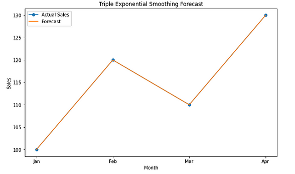
Upon executing the code, the output will be a plot illustrating the original sales data and the corresponding forecasts generated using triple exponential smoothing. Here’s an explanation of the output:
- The x-axis of the plot represents the months. In this case, the months are denoted by the values [‘Jan’, ‘Feb’, ‘Mar’, ‘Apr’].
- The y-axis represents the sales values.
- The blue line represents the actual sales data extracted from the DataFrame (
df['Sales']). - The orange line represents the forecasts produced using triple exponential smoothing (
df['Forecast']). - Circular markers (‘o’) are placed on the blue line at each data point to enhance visibility.
By examining the plot, you can compare the actual sales data with the forecasted values. This aids in evaluating the accuracy of the triple exponential smoothing model in capturing the underlying trend, seasonality, and level in the sales data.
If the forecasted line closely aligns with the actual sales line, it indicates that the model has effectively captured the patterns in the data. Conversely, significant deviations between the forecasted line and the actual sales line may indicate the need for adjustments or further analysis to improve the forecasting accuracy.
Analyzing the plot enables you to gain insights into the performance of the triple exponential smoothing technique in predicting future sales based on historical patterns.
Hey !! If you liked my content click here , to encourage me to write further.
Pre Reading: Exponential Smoothing in Business Analytics ( The α, β and γ of Business Analytics)

Comments
Post a Comment