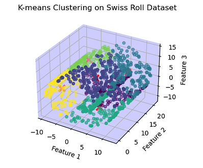
K-means Clustering 3D Plot Swiss roll Dataset
K-means is a widely used clustering algorithm in machine learning and data mining. It is an unsupervised learning algorithm that aims to partition a given dataset into distinct groups or clusters based on similarity of data points. The algorithm is called “K-means” because it divides the data into K clusters, where K is a user-specified parameter.
K-means aims to minimize the within-cluster sum of squares. The objective is to have the data points within each cluster as similar as possible, while keeping the clusters as distinct as possible. However, it’s important to note that K-means is sensitive to the initial random selection of cluster centers. Therefore, it’s often recommended to run the algorithm multiple times with different initializations and choose the clustering with the lowest inertia.
Here’s an example of K-means clustering using Python and machine learning:
import numpy as np
import matplotlib.pyplot as plt
from sklearn.cluster import KMeans
from sklearn.datasets import make_blobs
# Generate sample data
np.random.seed(0)
n_samples = 300
X, y = make_blobs(n_samples=n_samples, centers=4, cluster_std=0.60, random_state=0)# Perform K-means clustering
kmeans = KMeans(n_clusters=4)
kmeans.fit(X)# Assign cluster labels to each data point
labels = kmeans.labels_# Plot the data points and their cluster assignments
plt.scatter(X[:, 0], X[:, 1], c=labels, cmap='viridis')
plt.scatter(kmeans.cluster_centers_[:, 0], kmeans.cluster_centers_[:, 1], marker='x', color='red', s=100)
plt.title("K-means Clustering")
plt.xlabel("Feature 1")
plt.ylabel("Feature 2")
plt.show()
In this example, we use the make_blobs function from scikit-learn to generate synthetic data with four distinct clusters. We then use the K-means algorithm, implemented in the KMeans class from scikit-learn, to perform clustering on the data. The n_clusters parameter is set to 4, matching the number of clusters in the generated data.
After fitting the K-means model to the data, we obtain the cluster labels for each data point using the labels_ attribute. We then visualize the data points with their assigned cluster labels using a scatter plot. Additionally, we plot the cluster centers, obtained from the cluster_centers_ attribute of the fitted model, as red crosses.
Output:

The output is a beautiful plot showing the original data points and their assigned clusters, along with the cluster centers. The different colors represent different clusters, and the red crosses represent the cluster centers.
This example demonstrates how to use K-means clustering in Python to identify distinct groups or clusters in a dataset.
K-means on a 3-Dimensional Dataset:
The Swiss roll is a three-dimensional dataset with a spiral shape, often used for visualizations and testing clustering algorithms. The Swiss roll dataset provides an interesting and visually appealing example to showcase the capabilities of K-means clustering
Here’s an example of applying K-means clustering to the three-dimensional dataset :
import numpy as np
import matplotlib.pyplot as plt
from sklearn.cluster import KMeans
from sklearn.datasets import make_swiss_roll
# Generate a swiss roll dataset
n_samples = 1000
X, _ = make_swiss_roll(n_samples=n_samples, random_state=0)# Perform K-means clustering
kmeans = KMeans(n_clusters=6)
kmeans.fit(X)# Assign cluster labels to each data point
labels = kmeans.labels_# Plot the data points and their cluster assignments
fig = plt.figure()
ax = fig.add_subplot(111, projection='3d')
ax.scatter(X[:, 0], X[:, 1], X[:, 2], c=labels, cmap='viridis')
ax.scatter(kmeans.cluster_centers_[:, 0], kmeans.cluster_centers_[:, 1], kmeans.cluster_centers_[:, 2],
marker='x', color='red', s=100 , linewidths=3)# Set light blue background
ax.w_xaxis.set_pane_color((0.8, 0.8, 1.0, 1.0)) ax.w_yaxis.set_pane_color((0.8, 0.8, 1.0, 1.0)) ax.w_zaxis.set_pane_color((0.8, 0.8, 1.0, 1.0))ax.set_title("K-means Clustering on Swiss Roll Dataset")
ax.set_xlabel("Feature 1")
ax.set_ylabel("Feature 2")
ax.set_zlabel("Feature 3")
plt.show()
In this example, we generate a unique dataset known as the “Swiss roll” using the make_swiss_roll function from scikit-learn.
We then apply the K-means clustering algorithm with n_clusters=6 to find six distinct clusters within the Swiss roll dataset. After fitting the K-means model to the data, we obtain the cluster labels for each data point.
Finally, we plot the data points and their assigned cluster labels in a 3D scatter plot using the projection='3d' parameter. The colors of the data points indicate their assigned clusters, and the cluster centers are plotted as red crosses.
Output:

The Output is a unique 3D plot where data points belonging to different clusters are represented by different colors. The red crosses indicate the cluster centers.The background color of the 3D plot is set to light blue.
However, it’s important to note that K-means might not be the most suitable clustering algorithm for all types of datasets, especially those with complex structures or non-linear patterns.
K-means is relatively fast and scalable, making it suitable for large datasets. However, it has a few limitations. It assumes clusters to be spherical, equally sized, and having similar densities. It also requires specifying the number of clusters K in advance, which can be challenging if the optimal number of clusters is unknown.
Despite its limitations, K-means remains a widely used clustering algorithm in various domains, including image segmentation, customer segmentation, document clustering, and anomaly detection.
Hey!! If you like my content, click here to support my writing.

Comments
Post a Comment