Data Visualization Using Pandas
Data Visualization Using Pandas
Data Visualization is the graphical representation of data and information. It enables the analyst to understand the data, draw insights, identify patterns, and make better decisions. Pandas is a popular library for data analysis and manipulation. Pandas provides a range of tools for data visualization. These tools can be used to generate charts, graphs, and other visualizations that help to communicate insights and information effectively.
Data Visualization using Pandas involves plotting different types of charts such as line plots, bar plots, scatter plots, histograms, and box plots. Pandas makes it easy to generate these charts directly from the data frames. The visualizations can be customized with different colors, styles, and labels to make them more informative and visually appealing.
In this module, we will learn how to use Pandas to create different types of charts and graphs. We will explore different types of visualizations and learn how to customize them to make them more informative. We will also learn how to use these visualizations to communicate insights and findings effectively.
here are some examples of data visualization using Pandas:
- Line plot:
A line plot is a graph that shows the trend of a variable over time.pythonimport pandas as pd import matplotlib.pyplot as plt data = {'year': [2010, 2011, 2012, 2013, 2014, 2015],
'sales': [100, 200, 300, 400, 500, 600]} df = pd.DataFrame(data) plt.plot(df['year'], df['sales']) plt.title('Sales Trend') plt.xlabel('Year') plt.ylabel('Sales') plt.show()
Output:

- Bar plot:
A bar plot is a graph that represents the data with rectangular bars.pythonimport pandas as pd import matplotlib.pyplot as plt data = {'language': ['Python', 'Java', 'C++', 'JavaScript', 'PHP'],
'users': [100, 80, 60, 50, 40]} df = pd.DataFrame(data) plt.bar(df['language'], df['users']) plt.title('Popular Programming Languages') plt.xlabel('Language') plt.ylabel('Users') plt.show()

- Scatter plot:
A scatter plot is a graph that shows the relationship between two variables.pythonimport pandas as pd import matplotlib.pyplot as plt data = {'height': [165, 170, 175, 180, 185],
'weight': [60, 70, 80, 90, 100]} df = pd.DataFrame(data) plt.scatter(df['height'], df['weight']) plt.title('Height vs. Weight') plt.xlabel('Height') plt.ylabel('Weight') plt.show()
Output:

- Histogram:
A histogram is a graph that shows the distribution of a variable.
pythonimport pandas as pd import matplotlib.pyplot as plt data = {'age': [20, 22, 25, 30, 35, 40, 45, 50, 55, 60, 65, 70]} df = pd.DataFrame(data) plt.hist(df['age'], bins=5) plt.title('Age Distribution') plt.xlabel('Age') plt.ylabel('Count') plt.show()
Output:

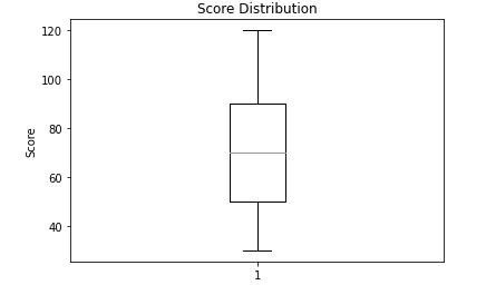
- Box plot:
A box plot is a graph that shows the distribution of a variable and highlights the outliers.pythonimport pandas as pd import matplotlib.pyplot as plt data = {'score': [70, 80, 90, 100, 60, 50, 40, 30, 120]}df = pd.DataFrame(data) plt.boxplot(df['score']) plt.title('Score Distribution') plt.ylabel('Score') plt.show()
Output:


Comments
Post a Comment