Outlier detection Z-Score Method: Python Pandas
To find outliers in a dataset, you can use various statistical methods and visualization techniques. Here’s a step-by-step approach to identify outliers and explain the process:
Step 1: Understand the Data. Before identifying outliers, it’s important to have a good understanding of the dataset you’re working with. Familiarize yourself with the variables and their meanings, as well as any potential data collection issues.
Step 2: Choose an Outlier Detection Method. There are several commonly used methods for outlier detection, including:
- Z-Score Method: Calculates the number of standard deviations away from the mean each data point is. Points beyond a certain threshold (e.g., 2 or 3 standard deviations) are considered outliers.
- IQR Method: Uses the Interquartile Range (IQR) to identify outliers. Points that fall below Q1–1.5 * IQR or above Q3 + 1.5 * IQR are considered outliers, where Q1 and Q3 represent the 25th and 75th percentiles, respectively.
- Mahalanobis Distance: Takes into account the correlation between variables to measure the distance of each data point from the centroid of the data. Points with higher distances are considered outliers.
- Density-Based Outlier Detection (DBSCAN): A clustering-based method that identifies outliers as data points that don’t belong to any cluster or are part of very small clusters.
These are just a few examples, and the choice of method depends on the nature of your data and the specific requirements of your analysis.
Step 3: Implement the Chosen Method. Once you’ve selected a method, implement it in your preferred programming language or statistical software. Calculate the outlier values or flag the outlier data points based on the chosen method.
Step 4: Visualize the Outliers. Visualizations can provide a clear understanding of outliers in the dataset. Here are a few common approaches:
- Box Plot: Create a box plot to visualize the distribution of the data. Outliers will be represented as points outside the whiskers of the plot.
- Scatter Plot: For datasets with two variables, create a scatter plot and mark the outliers as distinct points.
- Histogram: Plot a histogram to visualize the distribution of a single variable. Outliers will appear as bars far away from the main distribution.
- Heatmap: If working with a multidimensional dataset, you can create a heatmap to visualize the Mahalanobis distance or other measures of outlier detection.
Step 5: Explain the Outliers. Once you have identified outliers and visualized them, it’s important to investigate and understand why they occurred. Consider factors such as data entry errors, measurement issues, or genuine anomalies in the data. Depending on the domain and context, outliers can be further analyzed or treated, such as through data cleaning, transformation, or removal.
Example:
Let’s use the “Iris” dataset from the scikit-learn library, which is a popular dataset for classification tasks and contains information about different iris flower species. Let’s explore the various outlier detection methods with the Iris dataset and plot them.
- Z-Score Method: Calculates the number of standard deviations away from the mean each data point is. Points beyond a certain threshold (e.g., 2 or 3 standard deviations) are considered outliers.
Here’s an example of how to detect outliers in the Iris dataset using the Z-Score method:
import numpy as np
import pandas as pd
import matplotlib.pyplot as plt
from sklearn.datasets import load_iris
# Load the Iris dataset
iris = load_iris()
data = iris.data
feature_names = iris.feature_names
# Create a DataFrame for the dataset
df = pd.DataFrame(data, columns=feature_names)
# Calculate z-scores for each feature
z_scores = (df - df.mean()) / df.std()
# Set a threshold for outlier detection (e.g., 3 standard deviations)
threshold = 3
# Identify outliers for each feature
outliers = np.abs(z_scores) > threshold
# Find rows containing outliers in any feature
outliers_any = outliers.any(axis=1)
# Print the rows containing outliers
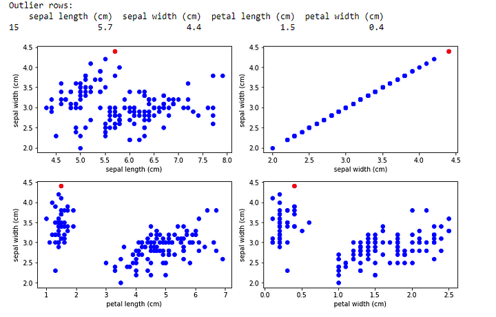
print("Outlier rows:")
print(df[outliers_any])
# Plot the dataset with outliers for each feature
plt.figure(figsize=(10, 6))
for i, feature in enumerate(feature_names):
    plt.subplot(2, 2, i + 1)
    plt.scatter(df[feature], df['sepal width (cm)'], color='b')
    plt.scatter(df.loc[outliers_any, feature], df.loc[outliers_any, 'sepal width (cm)'], color='r')
    plt.xlabel(feature)
    plt.ylabel('sepal width (cm)')
plt.tight_layout()
plt.show()
In this example, we load the Iris dataset using the load_iris() function from scikit-learn. We calculate the z-scores for each feature by subtracting the mean and dividing by the standard deviation.
We set a threshold of 3 standard deviations to identify outliers. For each feature, we identify outliers by checking if the absolute z-scores are greater than the threshold.
The outliers variable is a DataFrame that contains True or False values indicating whether each data point is an outlier for each feature. We then find rows containing outliers in any feature by using the .any(axis=1) method.
Finally, we print the rows containing outliers and create scatter plots for each feature against the “sepal width (cm)” variable to visualize the dataset. The outliers are highlighted in red.
Output:
Please note that the Iris dataset is relatively clean and may have fewer outliers compared to other real-world datasets.
Remember that the interpretation and handling of outliers depend on the specific circumstances and the goals of your analysis.


Comments
Post a Comment